Client
Marinode-Ai Solutions LLP
Industry
Marine Technology, AI
Company Size
50+ employees
Website
marinode-ai.com
Location & Branches
Cochin, Kerala, India
Marinode-Ai Solutions LLP is a startup based in Kerala, India, focused on bringing modern technology to the maritime industry. Their goal is to help seafarers and marine engineers work more efficiently and safely by using smart, AI-powered tools. With a strong understanding of the real-life challenges on ships—like limited internet, tough working conditions, and complex machinery—Marinode-Ai builds easy-to-use applications that deliver real-time insights and support better decision-making. Their main products, Engine Room Ninja and Engine Room Samurai, are designed to make life easier for people at sea by turning complex data into clear, useful information.
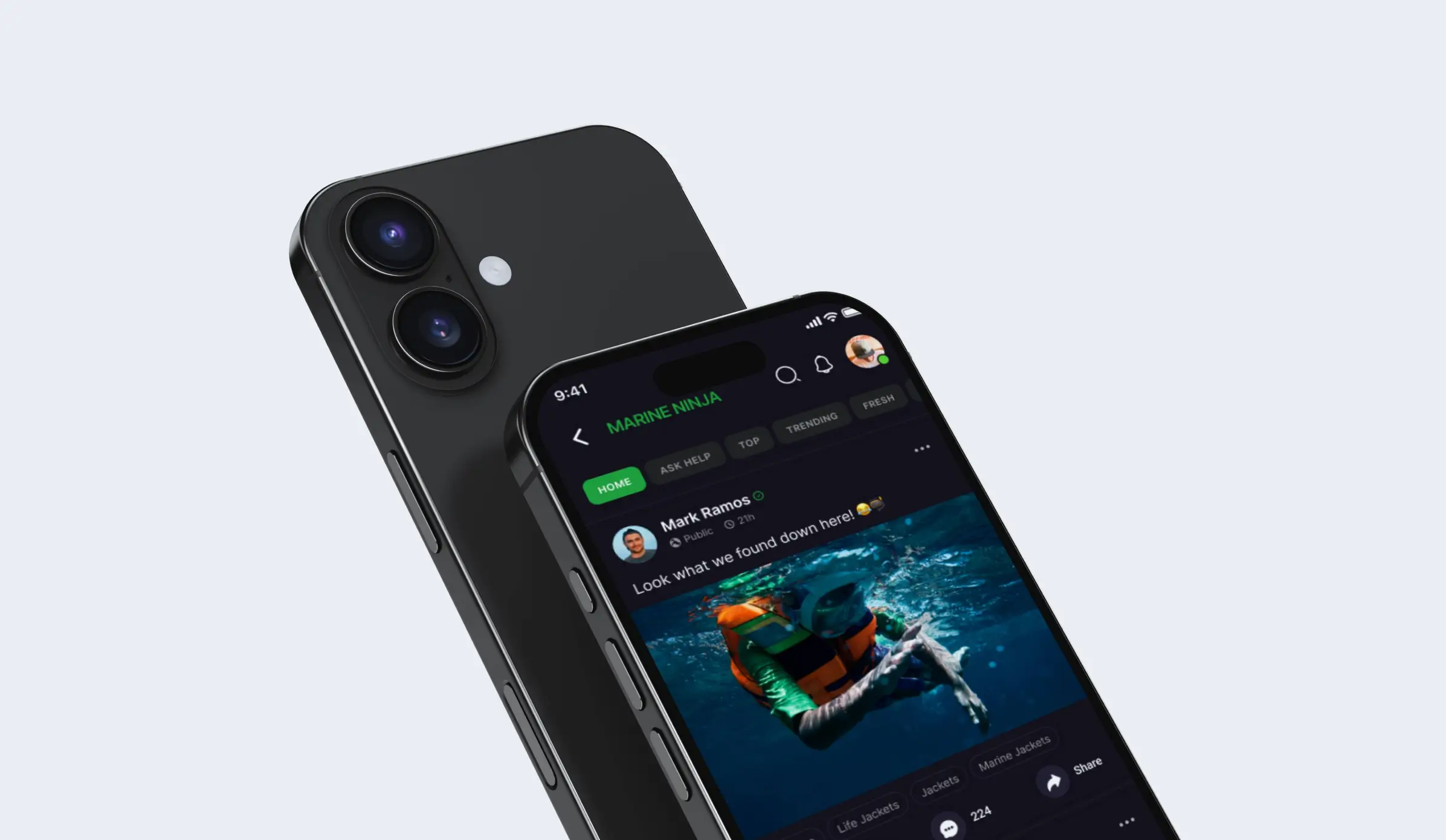
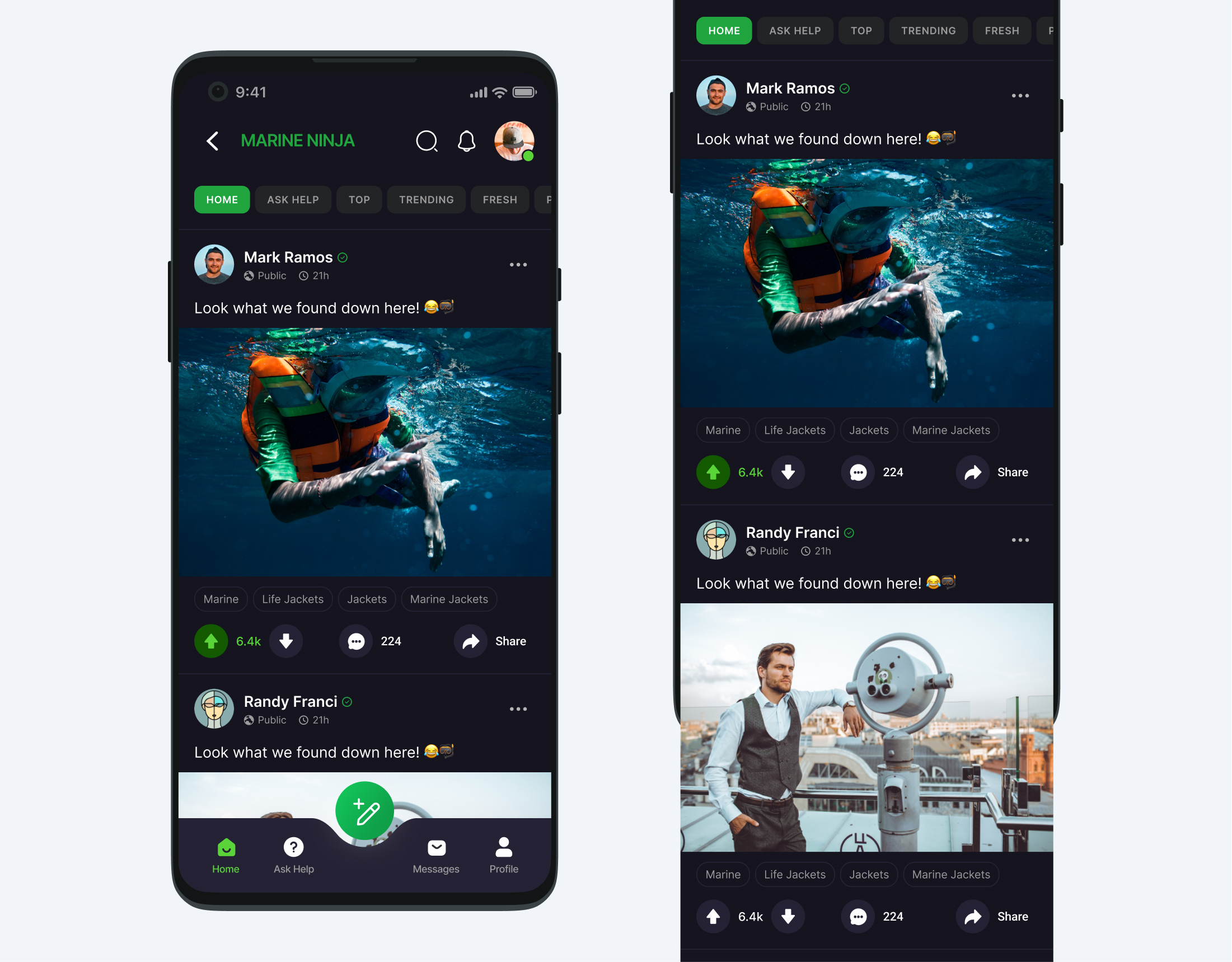
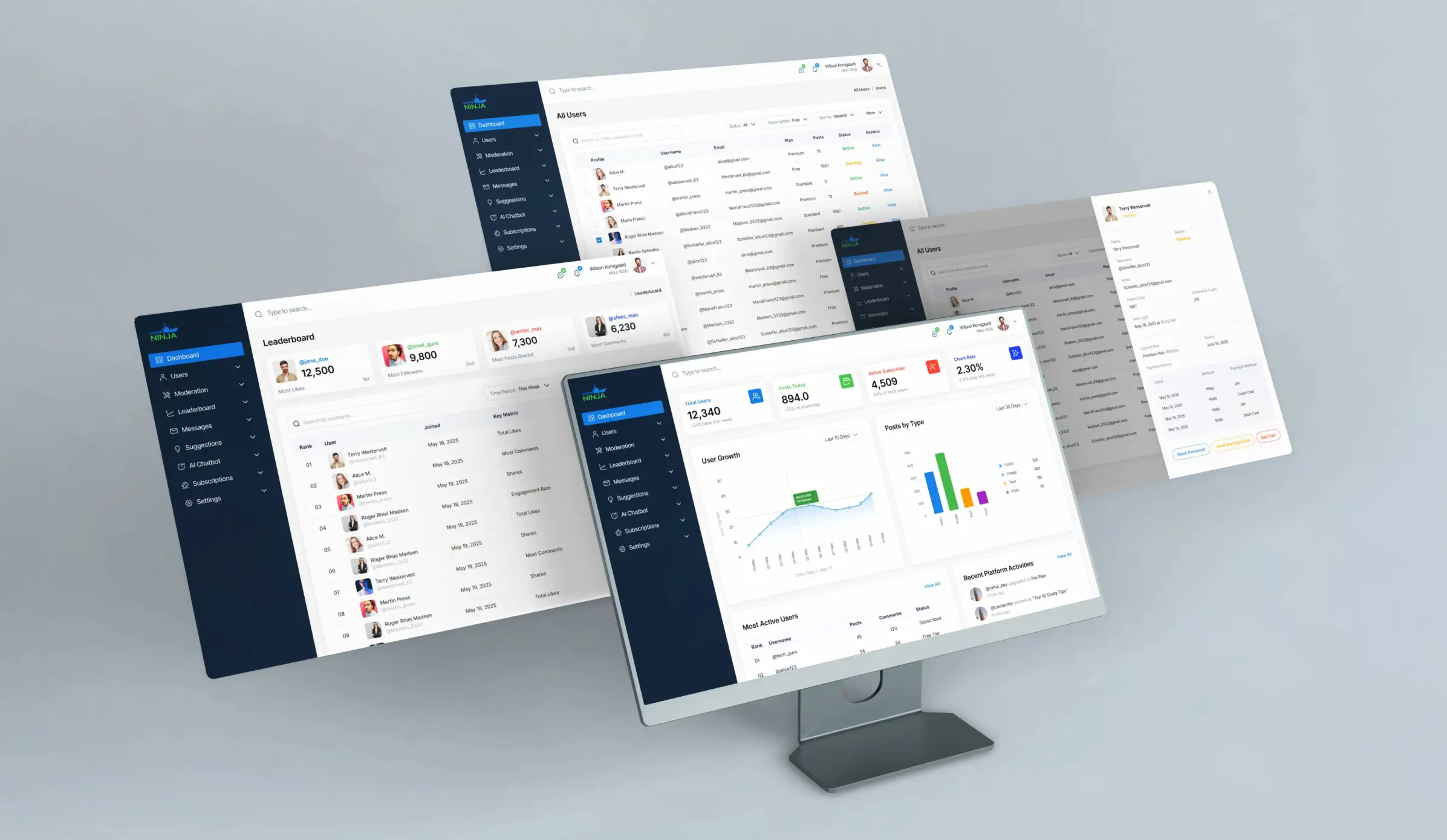
For Marine Ninja, the main idea was to build something that feels easy to use but powerful under the hood. Since the platform is made for people working in ships and marine environments, we wanted the design to be as clear and helpful as possible—no confusing screens, no tech overload. The web app works like familiar platforms such as Facebook, with features like reels, feed posts, voice tutorials, videos, photo uploads, comments, and upvotes or downvotes. It’s fully responsive, so whether someone is using it on a desktop in an office or a tablet on a ship, the experience stays smooth and simple.
We focused on making things easy to understand, fast to load, and comfortable to use, even in low-light or offline situations. Users can quickly learn from videos, ask questions, or share feedback—all in one place. On the backend, we designed an admin dashboard that gives the Marine Ninja team full control to manage content, users, and data without any hassle. The goal wasn’t just to build a tool—it was to create a space where users feel supported, stay connected, and actually enjoy using the product in their day-to-day work.
This project was about creating a platform for people working in the marine industry, often in tough conditions with limited internet and busy schedules. The main goal was to design something that feels easy to use, familiar, and reliable even when the connection is slow or missing. I started by learning about the users through online research, surveys, and interviews with both users and stakeholders. From this, I built user personas to understand who they are, what they need, and how they work every day. What stood out was that users want simple, fast, and clear tools that help them do their tasks without confusion or extra steps.
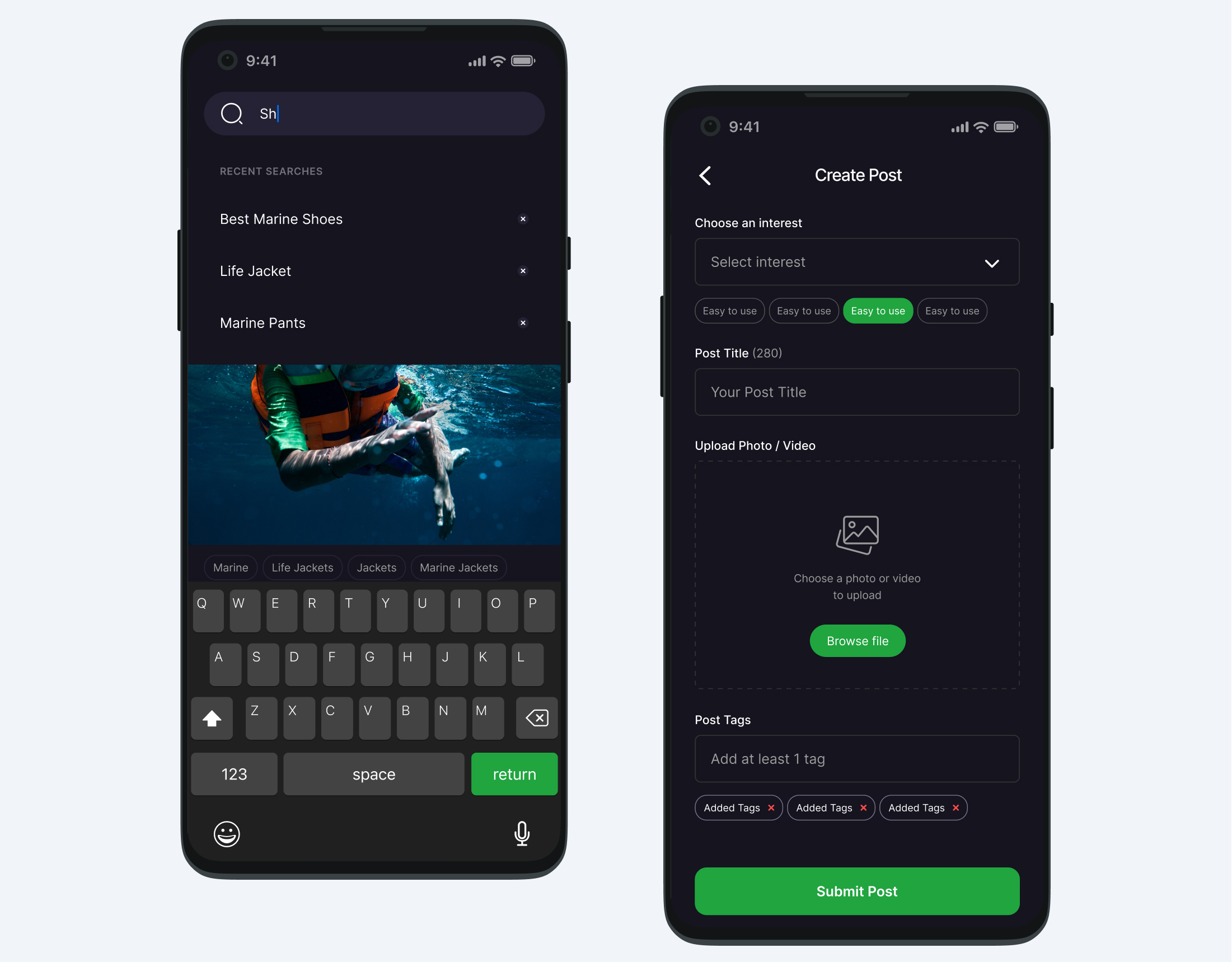
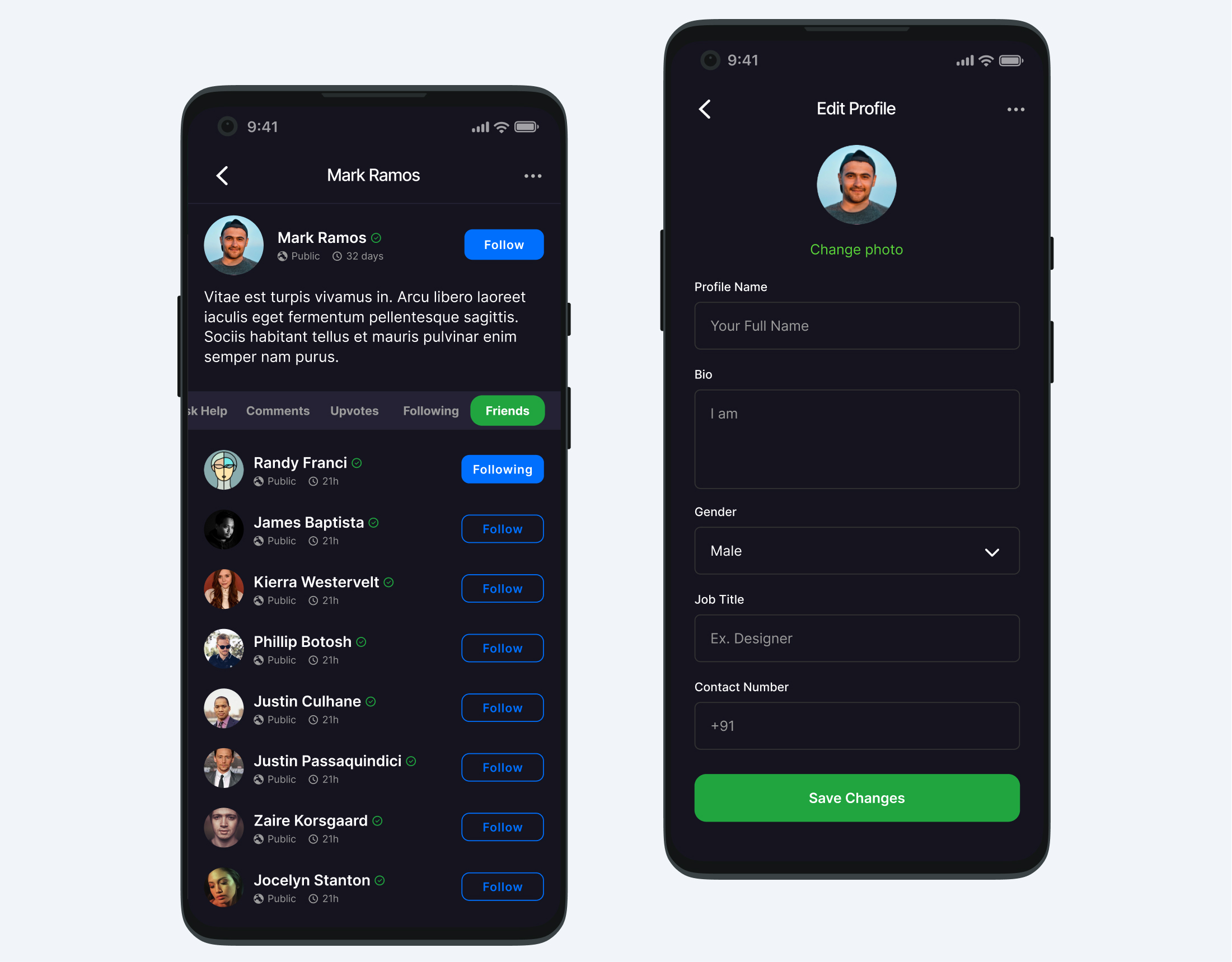
Most users preferred learning through short videos, voice guides, and pictures rather than long texts. We used this insight to decide how to organize and show content in the app. Early wireframes were tested with real users to see how they interacted with the feed, comments, and voting features. The feedback showed that using familiar social media-style interactions made the app easier and more enjoyable to use. At the same time, I worked with the team behind the scenes who manage the app’s content and users. They needed a dashboard that is simple and easy to control, without requiring technical skills. We designed this part carefully to make sure it is clear, quick, and practical.
I also created a clear structure for the app to help users find what they need quickly. Wireframes were updated many times based on testing to make navigation smooth and tasks easy to complete, even offline. Clear and friendly text helped users understand what to do at every step. By focusing on real user needs and testing often, the final design became a tool that feels natural and helpful. It supports users in learning, sharing, and staying connected no matter where they are or how tough the conditions get.

Based on the research, it became clear that users needed a platform that felt familiar, worked reliably across different environments, and was easy to use without requiring technical knowledge. Many users worked in challenging marine conditions with limited or no internet access. These insights heavily influenced the design direction. To create a comfortable and intuitive experience, the app was designed using patterns from familiar social platforms. Core features like scrolling feeds, reels, comments, and reactions helped users interact with the platform without a steep learning curve. The layout was kept clean, with clearly labeled buttons and simple navigation that worked smoothly on both desktops and tablets, whether on land or at sea.
User feedback also highlighted a strong preference for visual learning. As a result, the design prioritized short videos, voice notes, and photos over long text. Any necessary text was written clearly and kept brief to ensure quick understanding. The app was also optimized for fast loading, even in areas with weak or inconsistent network connections. On the admin side, the goal was to provide full control with minimal complexity. A custom dashboard was created to allow the internal team to manage users, posts, and data easily. Every feature was tested with real use cases to ensure it served a practical purpose.
Information structure was carefully planned to keep content organized and easy to navigate. The wireframes went through multiple rounds of usability testing and refinement to improve task flow and reduce friction. UX writing played a key role in guiding users clearly through the experience with simple, helpful messages. The final design offered a smooth, accessible, and user-friendly platform for both everyday users and the admin team. It created a reliable space where people could learn, share, and stay connected in a way that felt simple, supportive, and enjoyable.


This project was really about understanding the people using the platform and what their day-to-day looks like. These are folks working in tough conditions, often with spotty internet and not much time to figure things out. So, everything we designed was focused on making their lives easier. We wanted the app to feel familiar and simple — like something they’d already know how to use. We made sure it works well even when the connection is slow or missing, and used videos and voice notes because that’s how people really want to learn.
On the backend, the admin tools were built to be straightforward and stress-free, so the team could manage things without any headaches. At the heart of it, this wasn’t just about building a tool. It was about creating a space where people could connect, learn, and get things done without frustration. It showed me how powerful thoughtful, user-focused design can be in making a real difference.